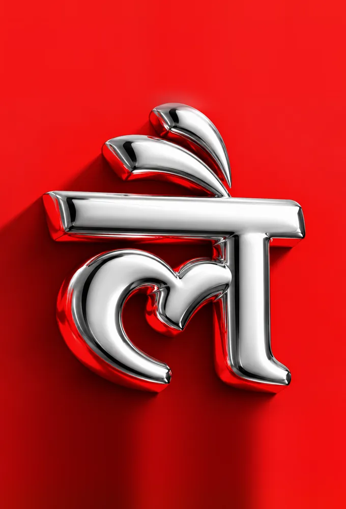
Our new identity — 17 September 2026 We turned red.
A new chapter
LemonTalks® is entering a new chapter, with a clearer focus on building distinctive brands for real estate and hospitality.
Then. Now.
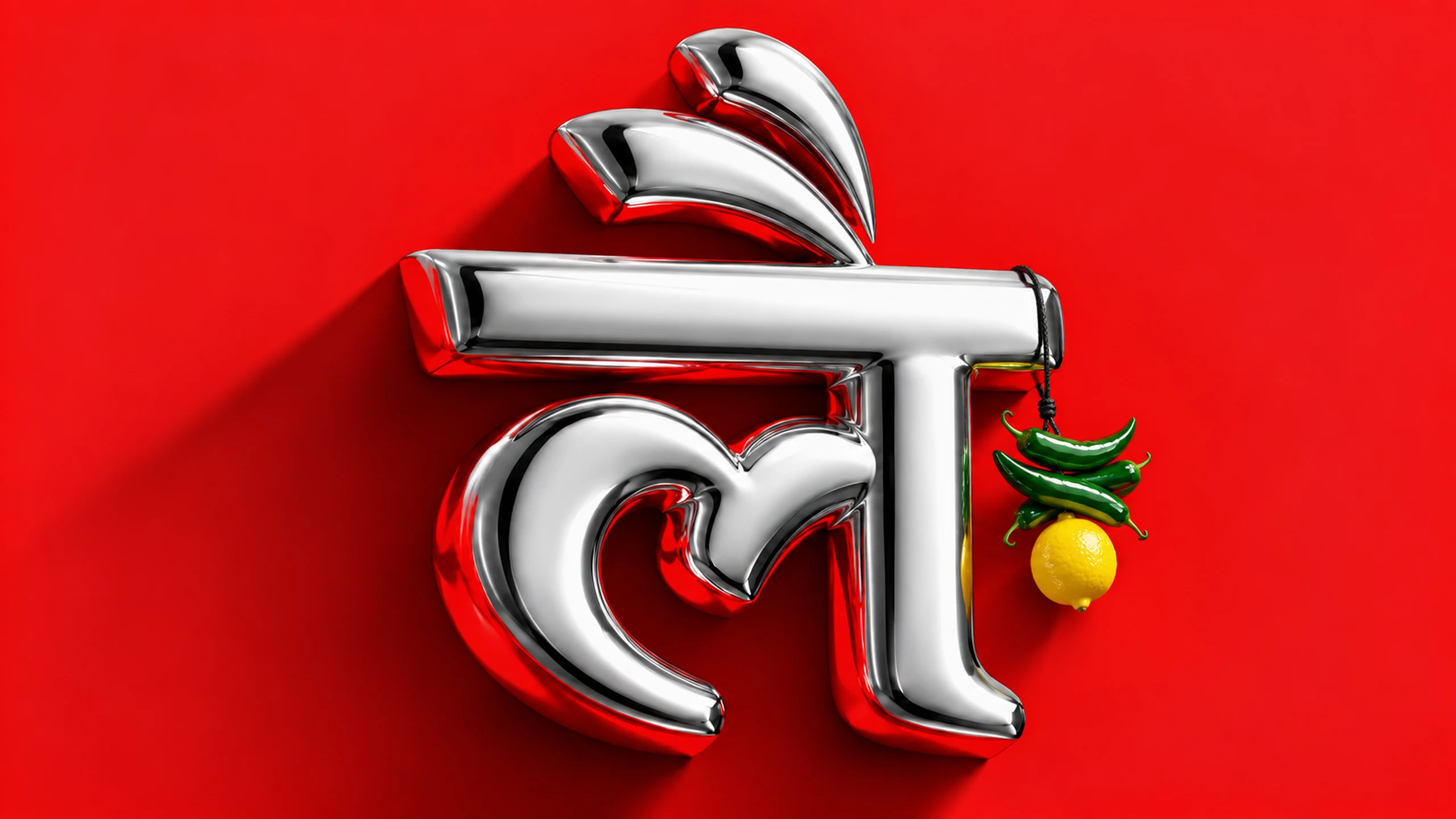
Drag to compare. Same company, same people, a bolder expression.
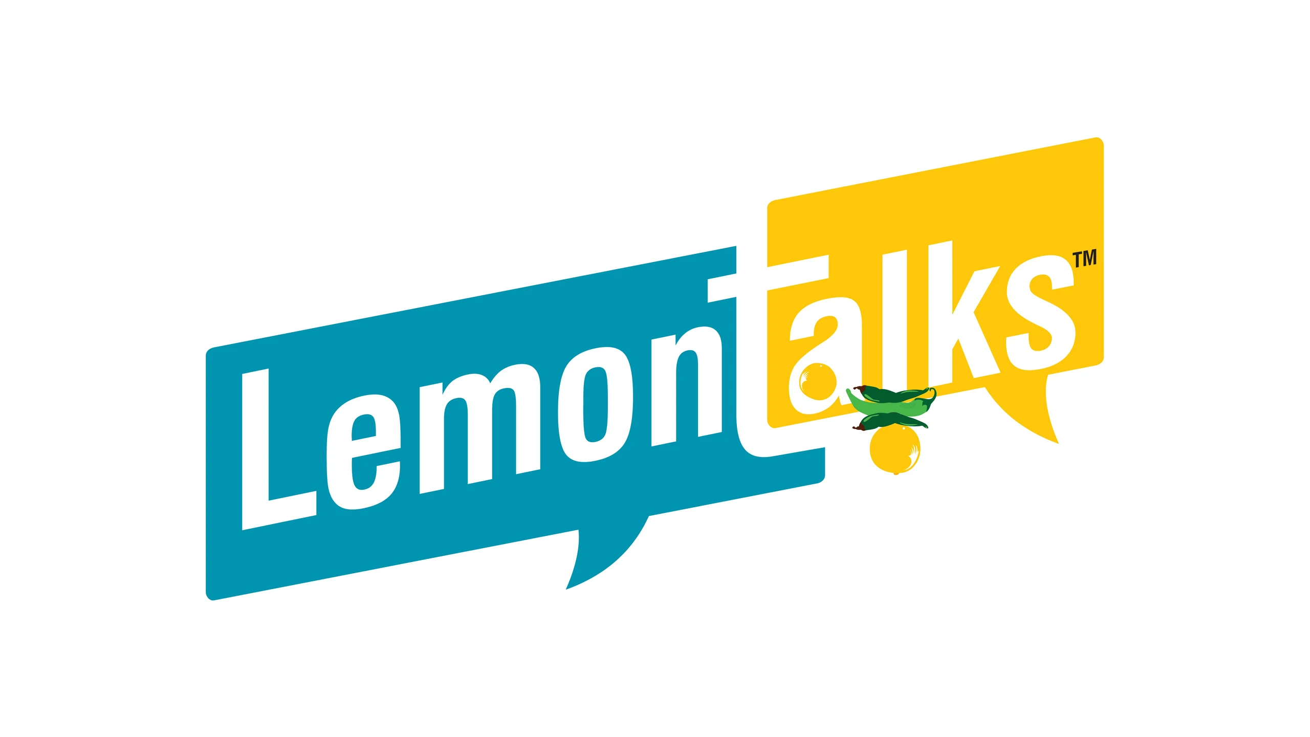
 Then
Now
Then
Now
The original LemonTalks™ logo remains our trademark and intellectual property.
The direction
One story, every touchpoint.
We’re bringing strategy, identity, websites and campaigns together to help our clients tell a stronger story at every touchpoint. Our new identity reflects that direction, and the ambition we bring to every brand we work with.
What we do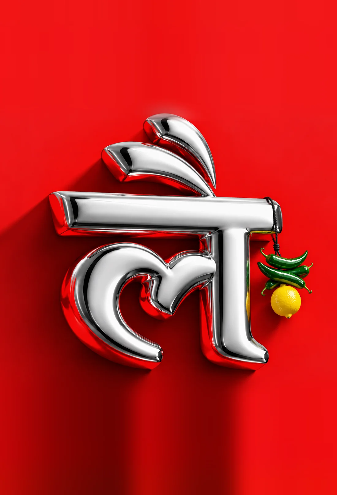
Why red?
For us, red represents conviction, creative energy and the confidence to be seen. It expresses what we want our work to do: make people pause, feel something and remember the brand behind it.
- Pause
- Feel
- Remember
Bold, with a little mirchi.
Rooted in India, made to be seen anywhere.
- लै
A Devanagari mark
A bold Hindi letter at the heart of the identity. Indian by origin, confident by design.
- 01
Nimbu-mirchi
The charm every Indian shopfront knows, and a nod to the lemon that has always been in our name.
- 02
Chrome on red
A polished, three-dimensional mark that feels crafted, premium and impossible to scroll past.
The system
A tight palette and two typefaces, used with a lot of confidence.
- LemonTalks® Red#D3030E
- Ink#0C0C0C
- Cream#F2EFE9
Make your mark.
Anton — headlines
LemonTalks.
Inter Tight — wordmark and text
What stays the same.
New colour, same people and the same commitment to every client.
-
01
The name
LemonTalks® stays LemonTalks®.
-
02
The team
The same people in the same studio in Gurugram.
-
03
The clients
Every relationship and every project continues as before.
-
04
The commitment
Personal attention, from the founder down.
We’re turning red. And giving our ambition a colour.
Planning something bold for your brand? Let’s talk.
Start a project